Creating a Second Home for Nubian Hueman
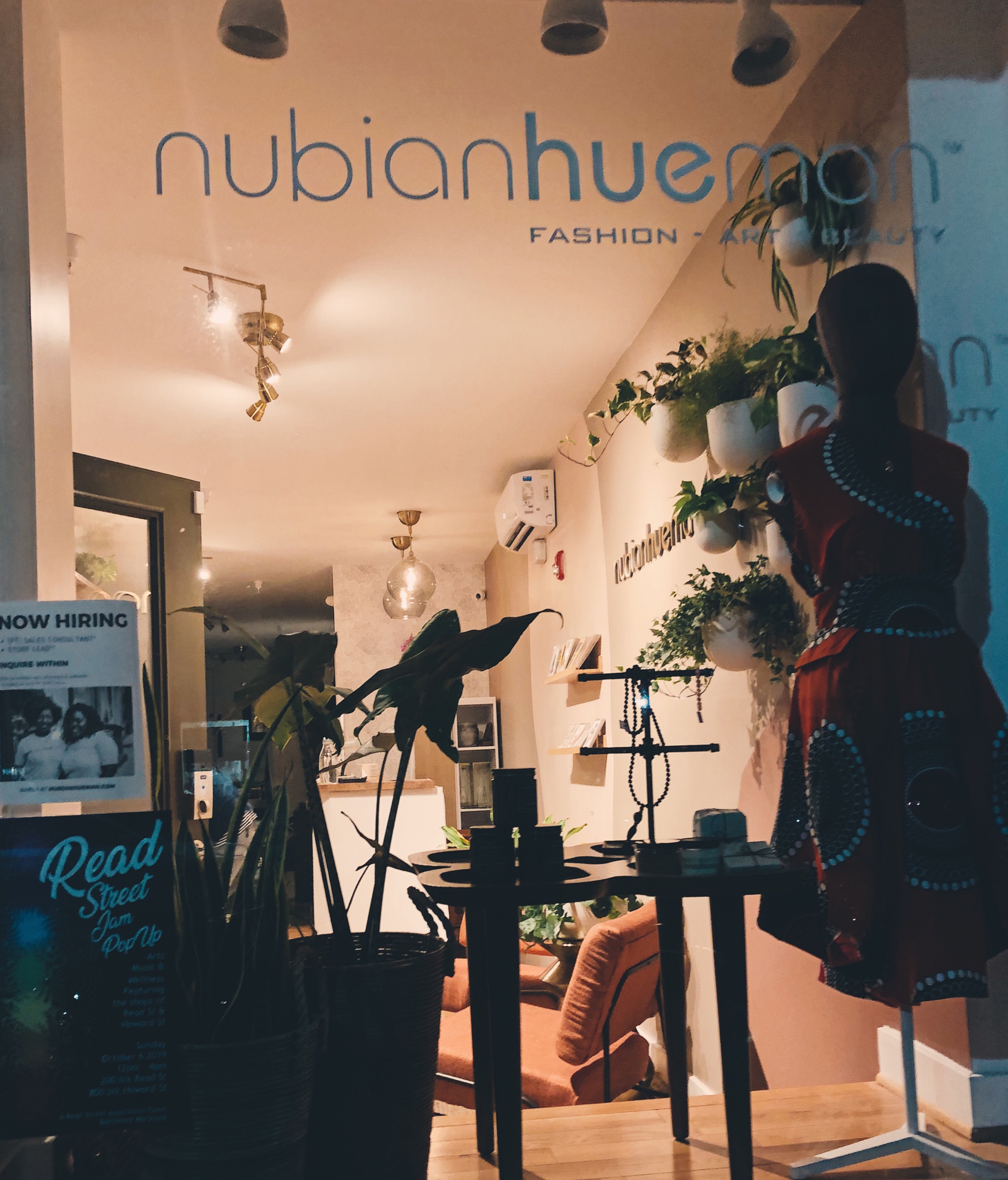
I love creating spaces that feel like home, so when Anika of Nubian Hueman asked me if I would be interested in designing the new Baltimore location, I thought it would be a fantastic project. In our initial conversation, Anika's most significant concern was that the new store has a fresh feel but still be on-brand with the original Anacostia location.
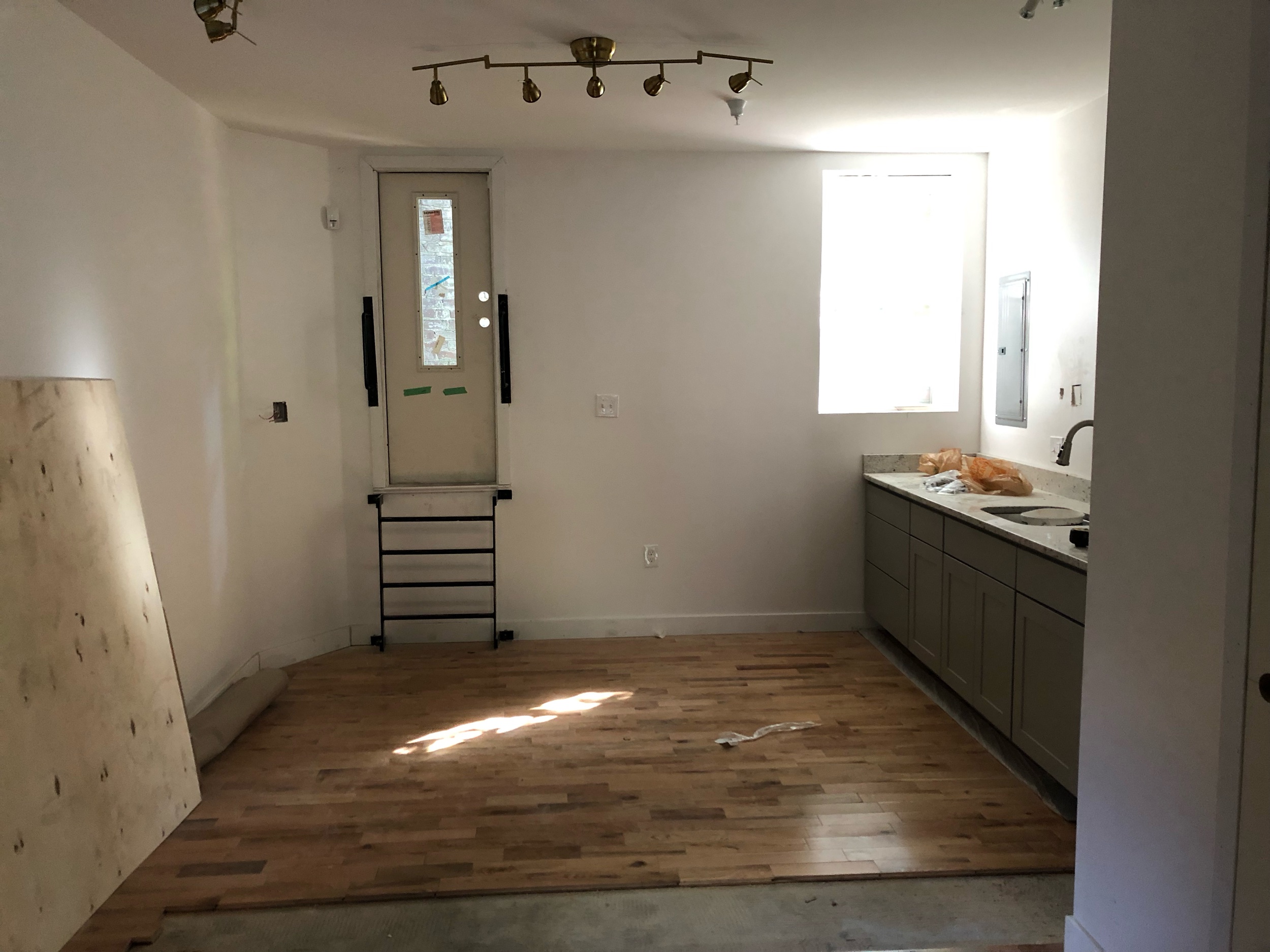
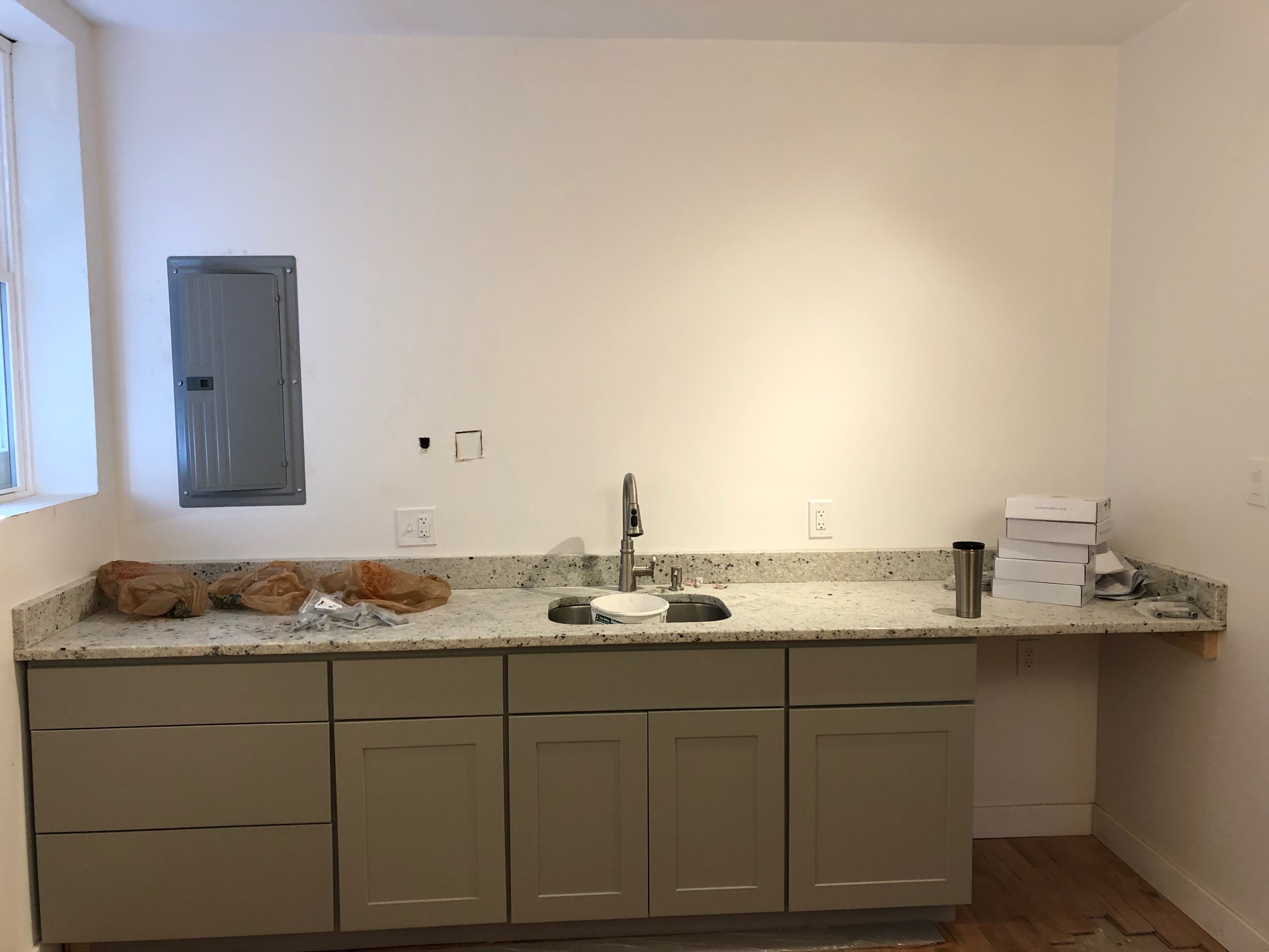
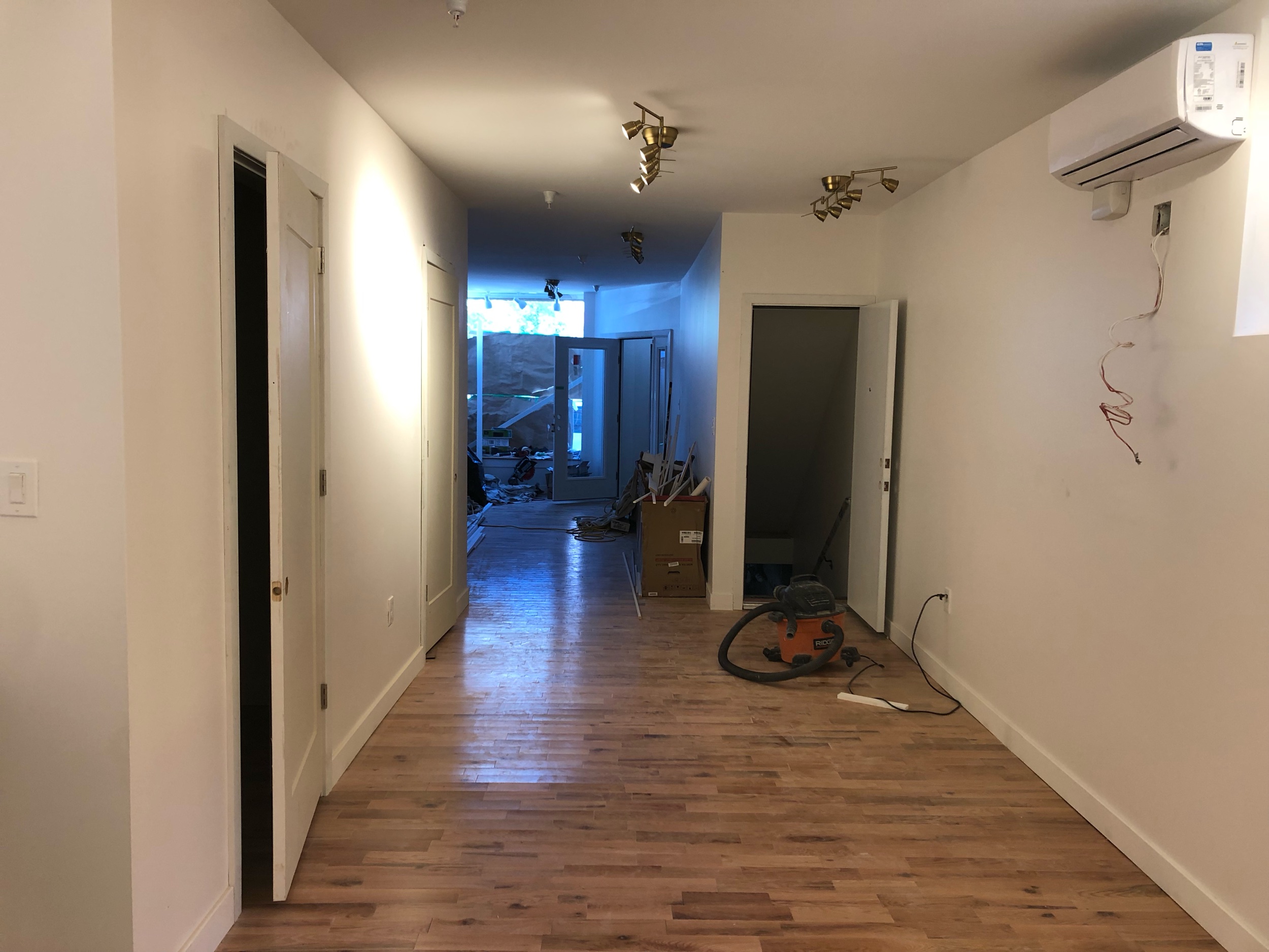
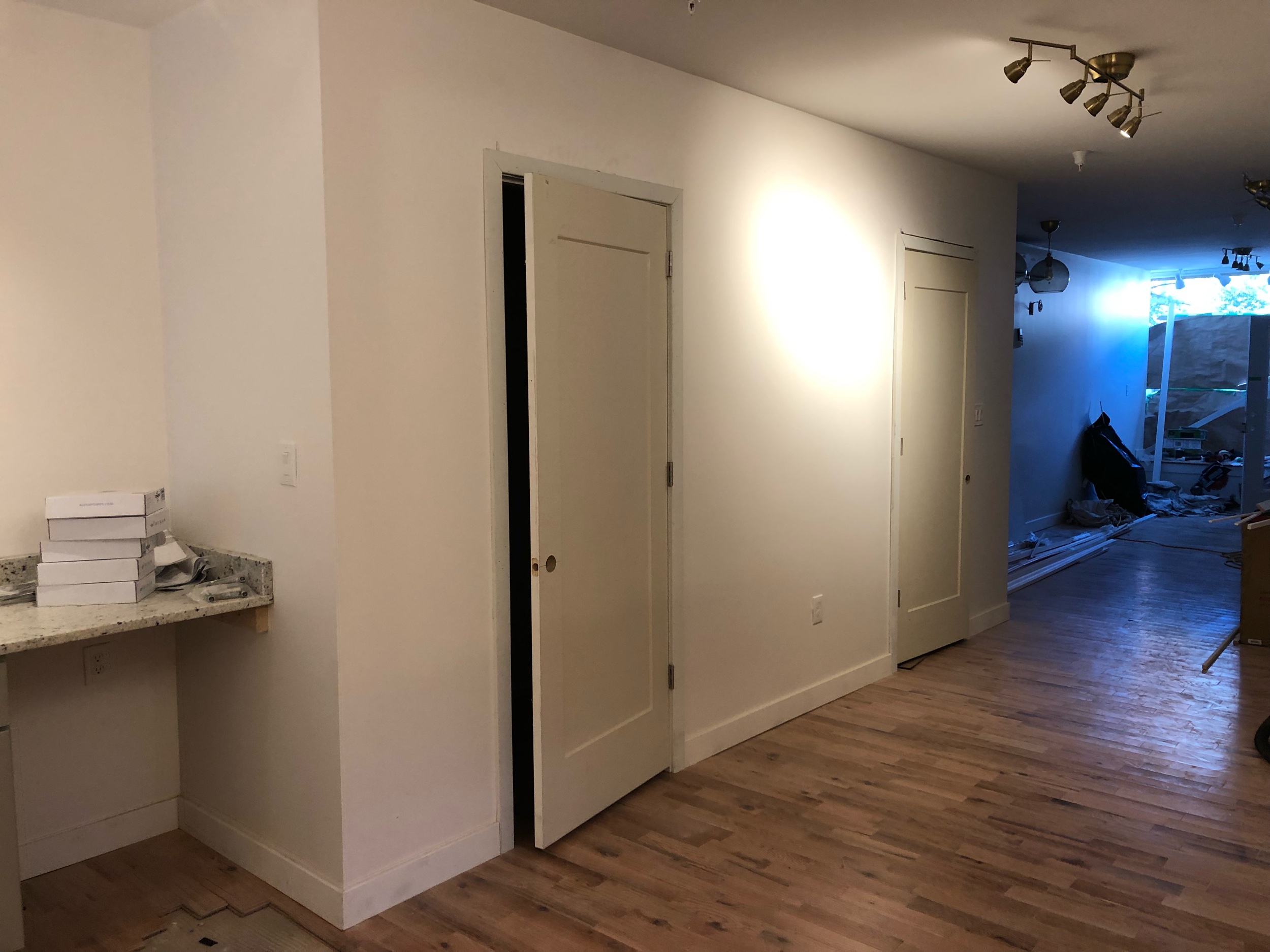
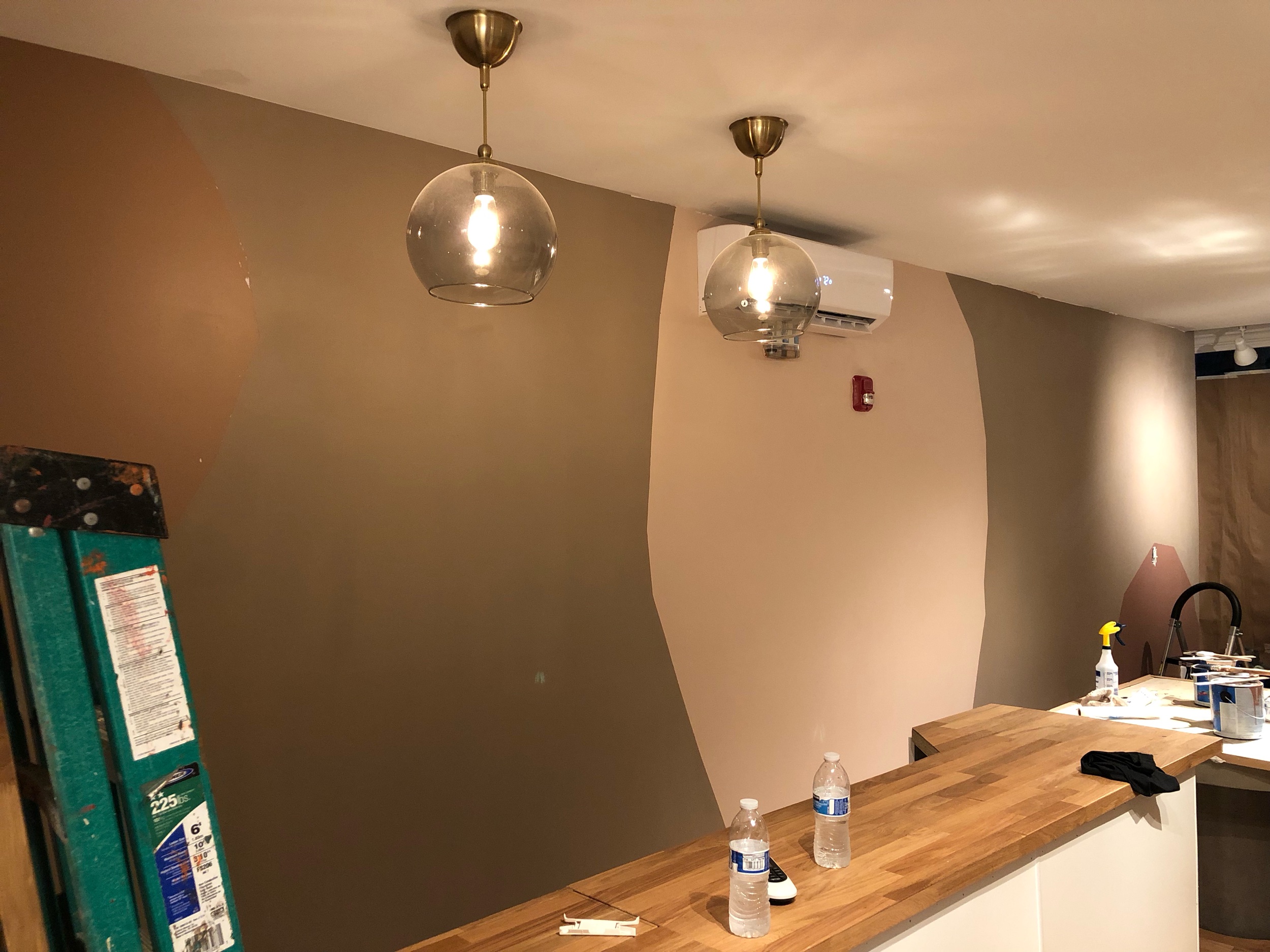
So here is what we started with.
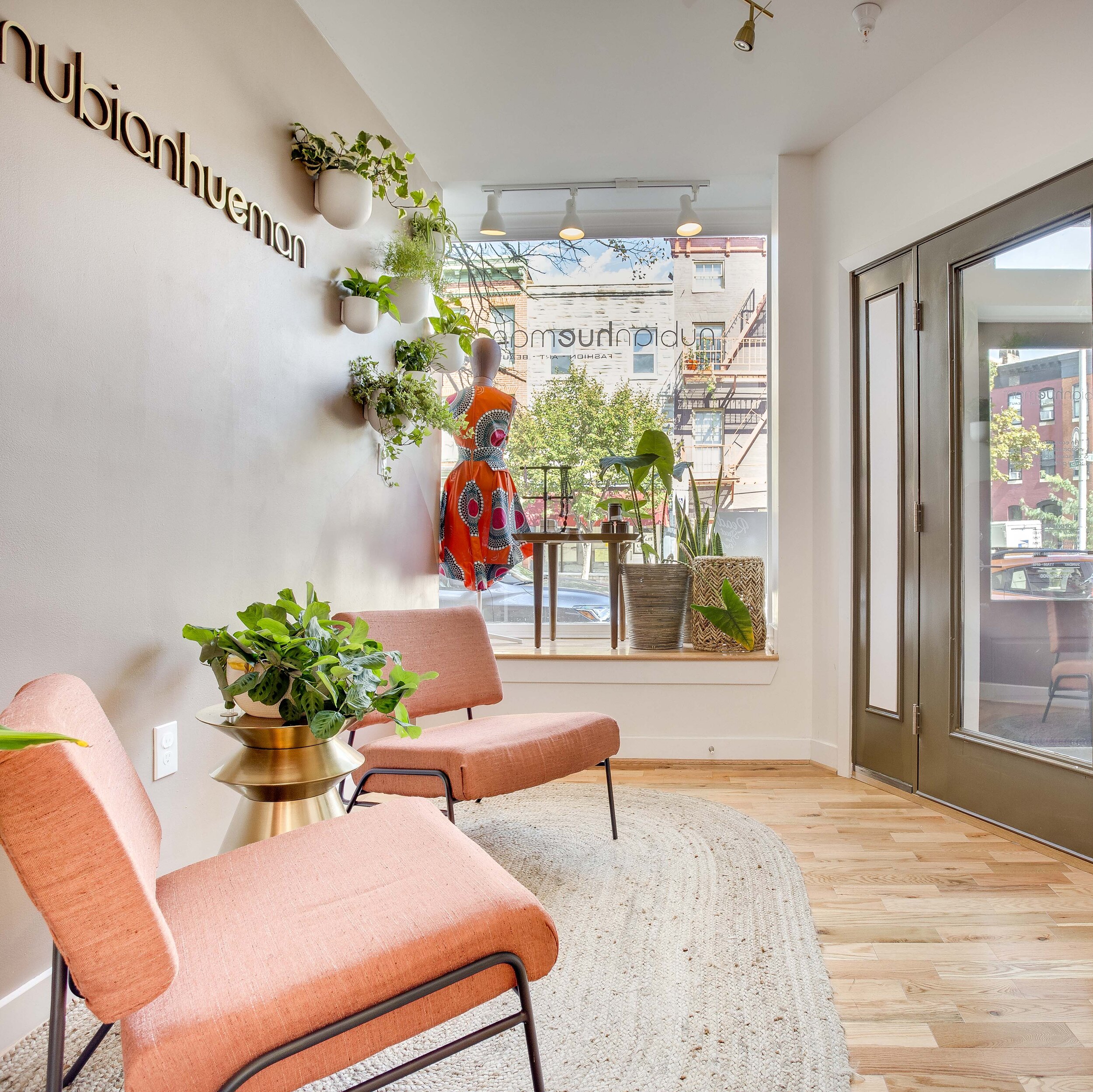
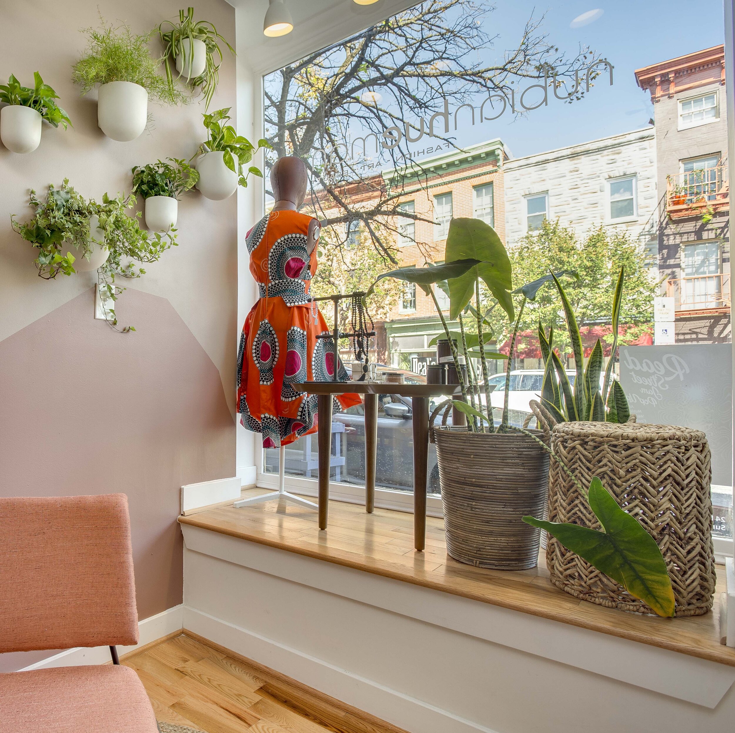
The space has beautiful natural light which was a plus as an element to play with, especially since the flagship does not have a storefront or natural light.
Beyond making sure that the space was on brand, we were focused on creating several memorable moments in the store and as much storage as possible.
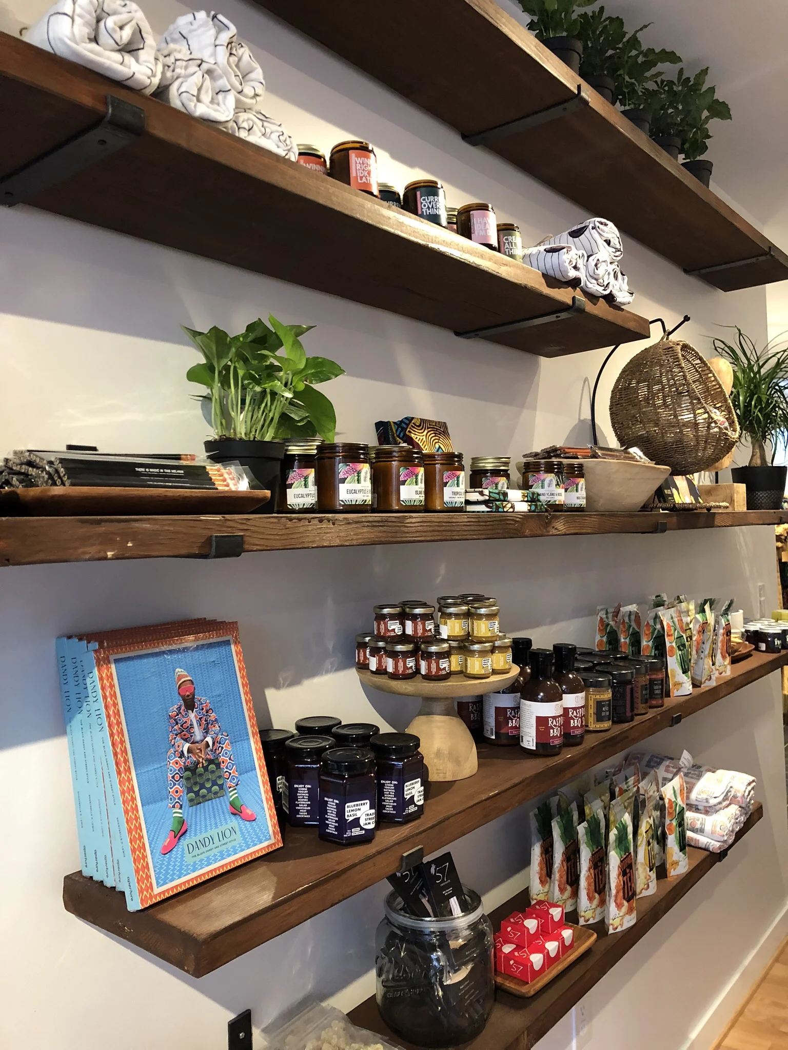
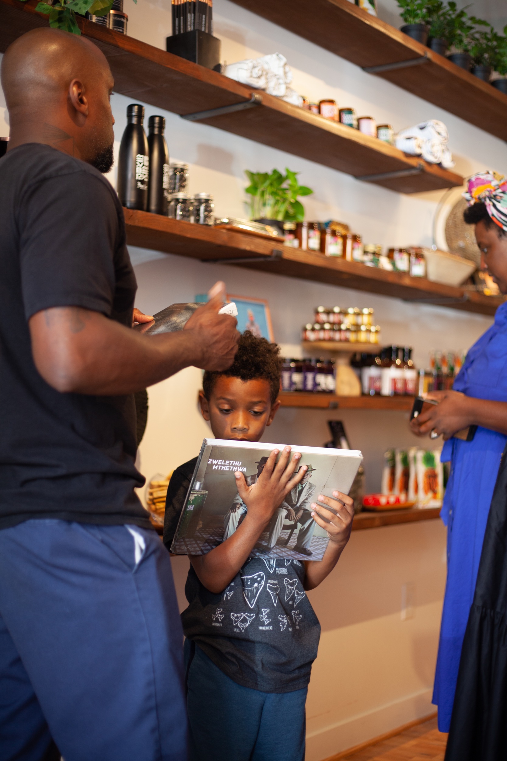
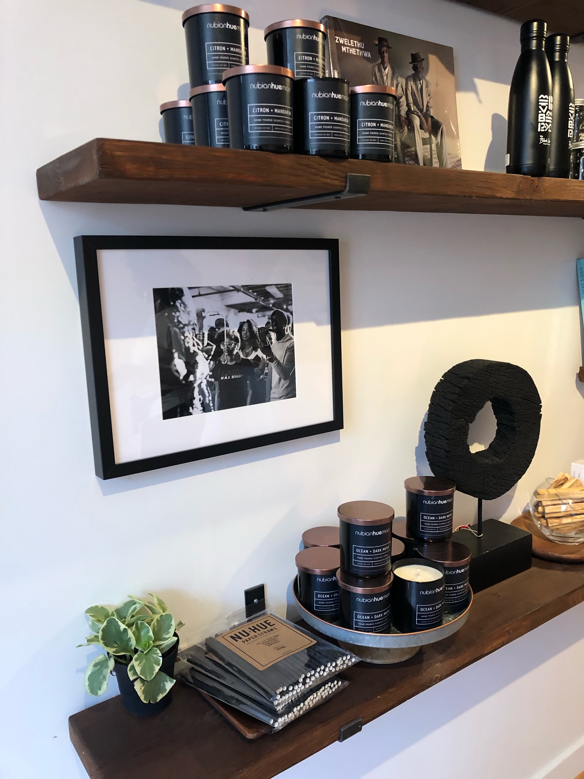
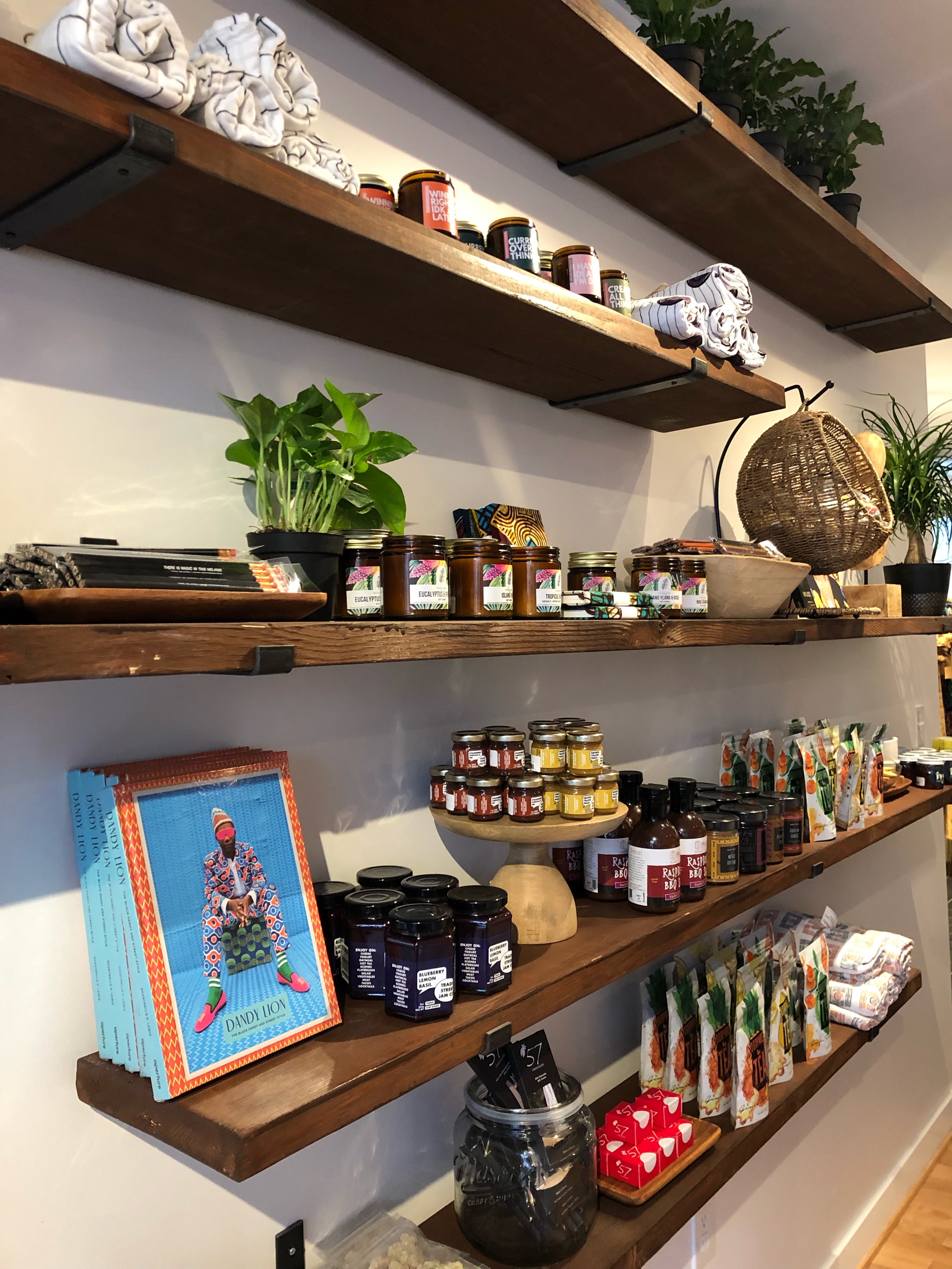
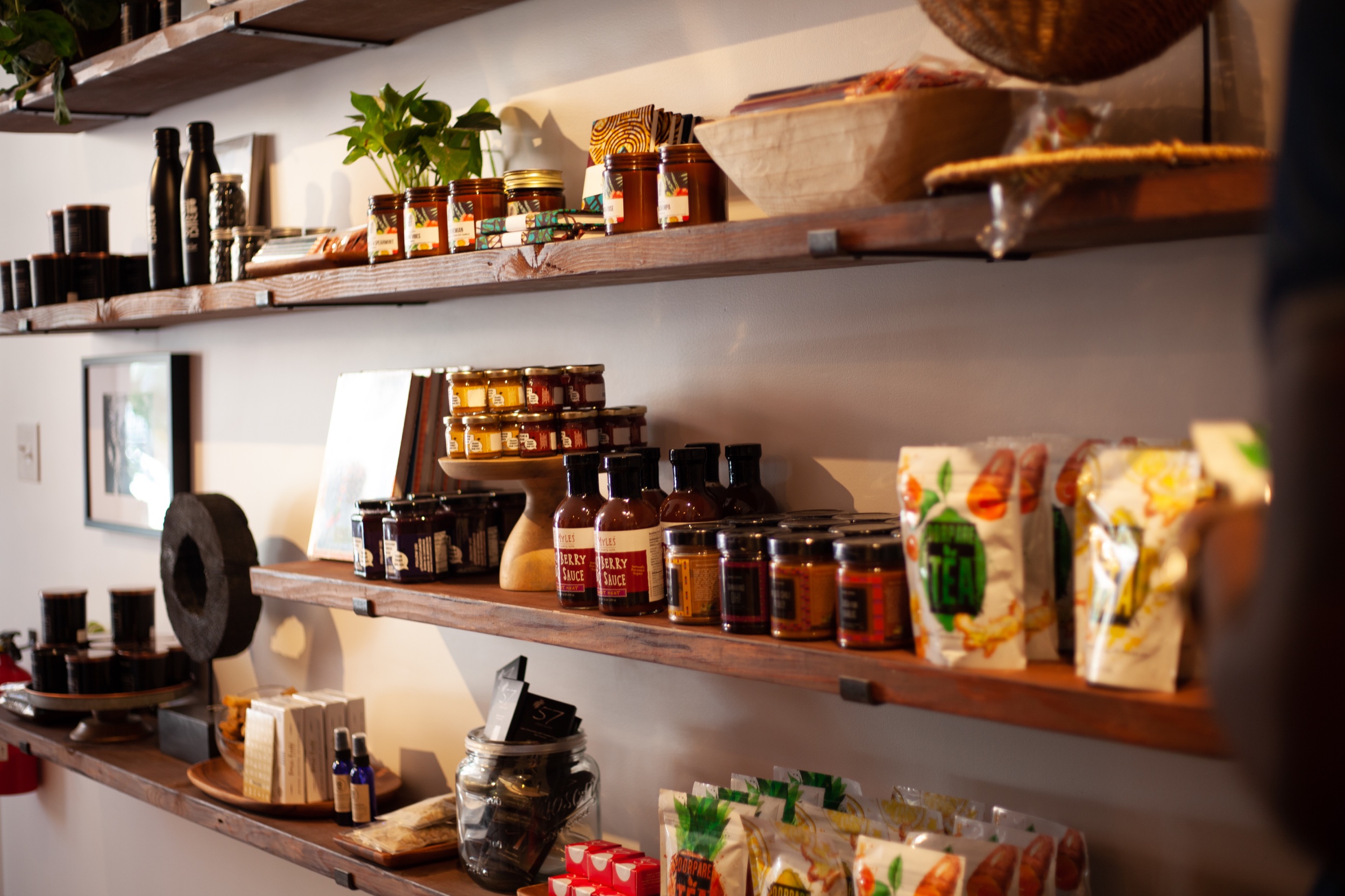
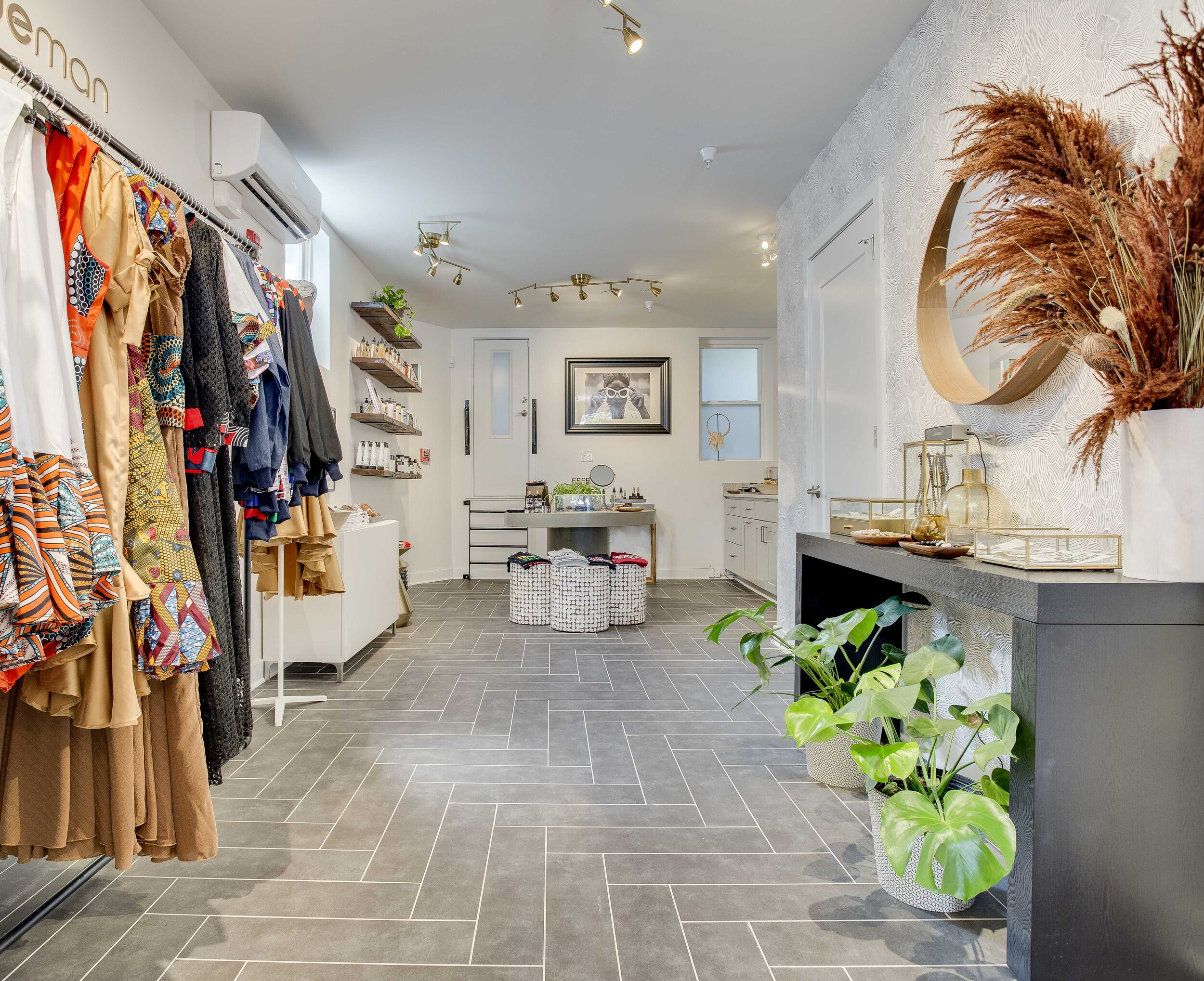
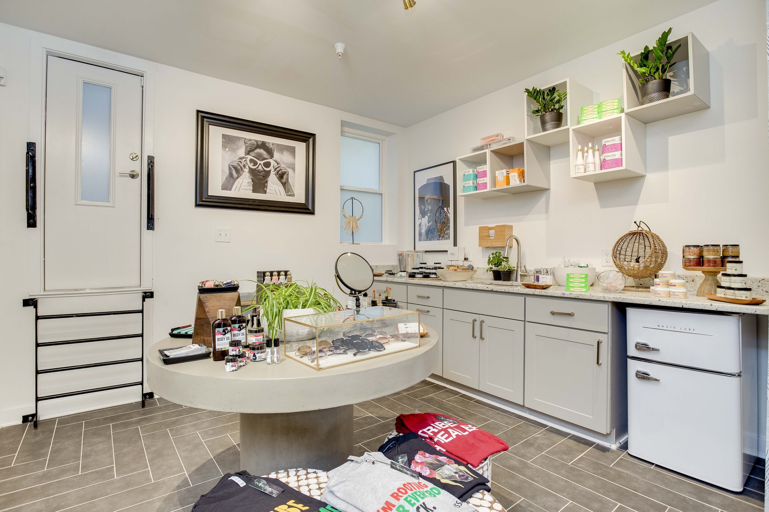
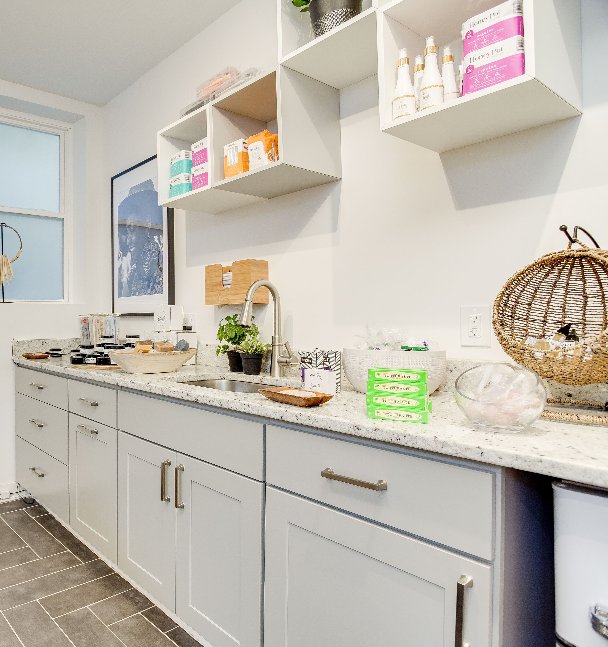
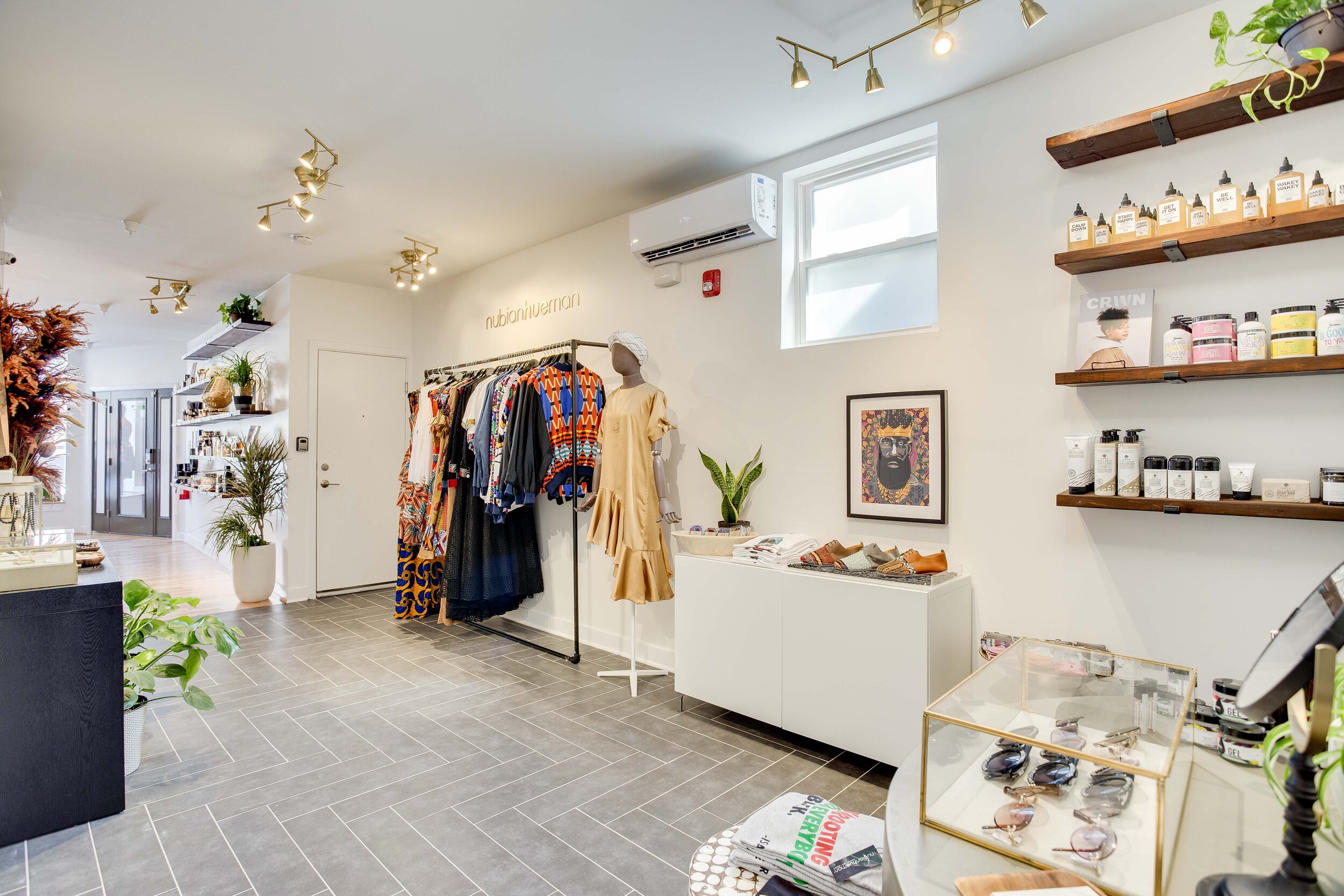
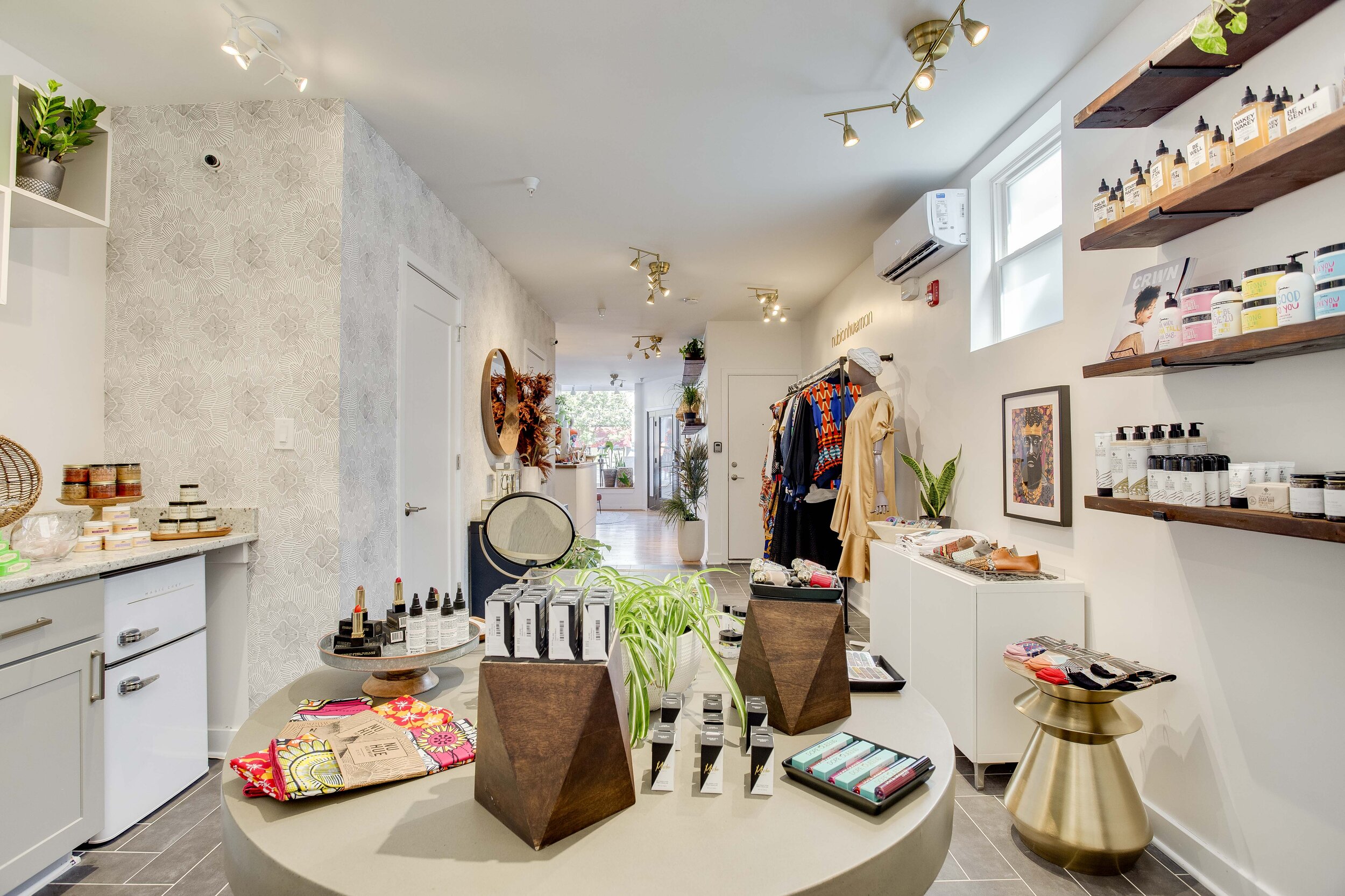
Since the space is narrow, we utilized all the wall space. The custom shelves went all the way up. The top shelves are not shoppable, but they provide much-needed storage for surplus product and bring your eyes up. It's also helpful to not have all the product display pieces be floor furniture.
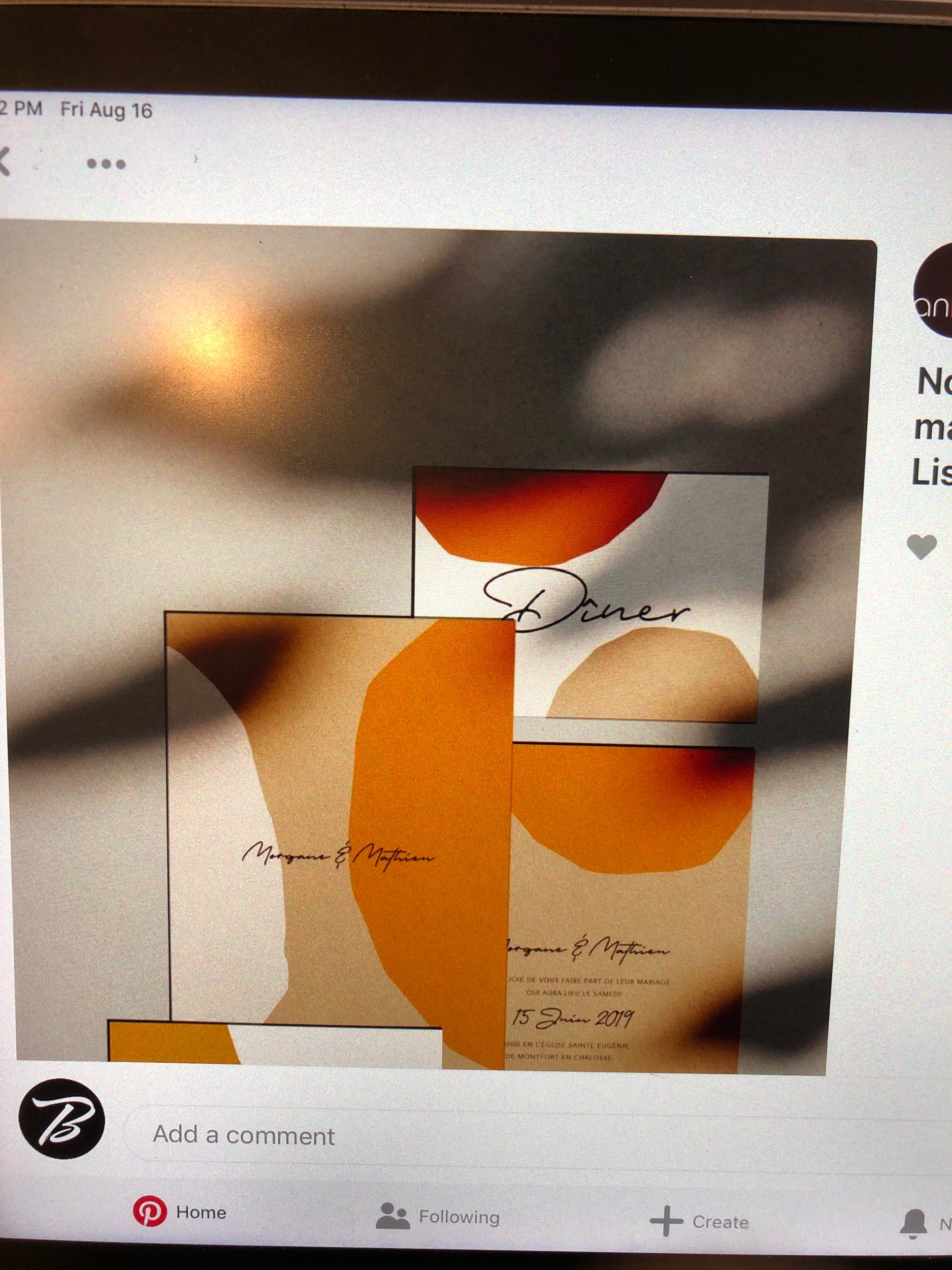
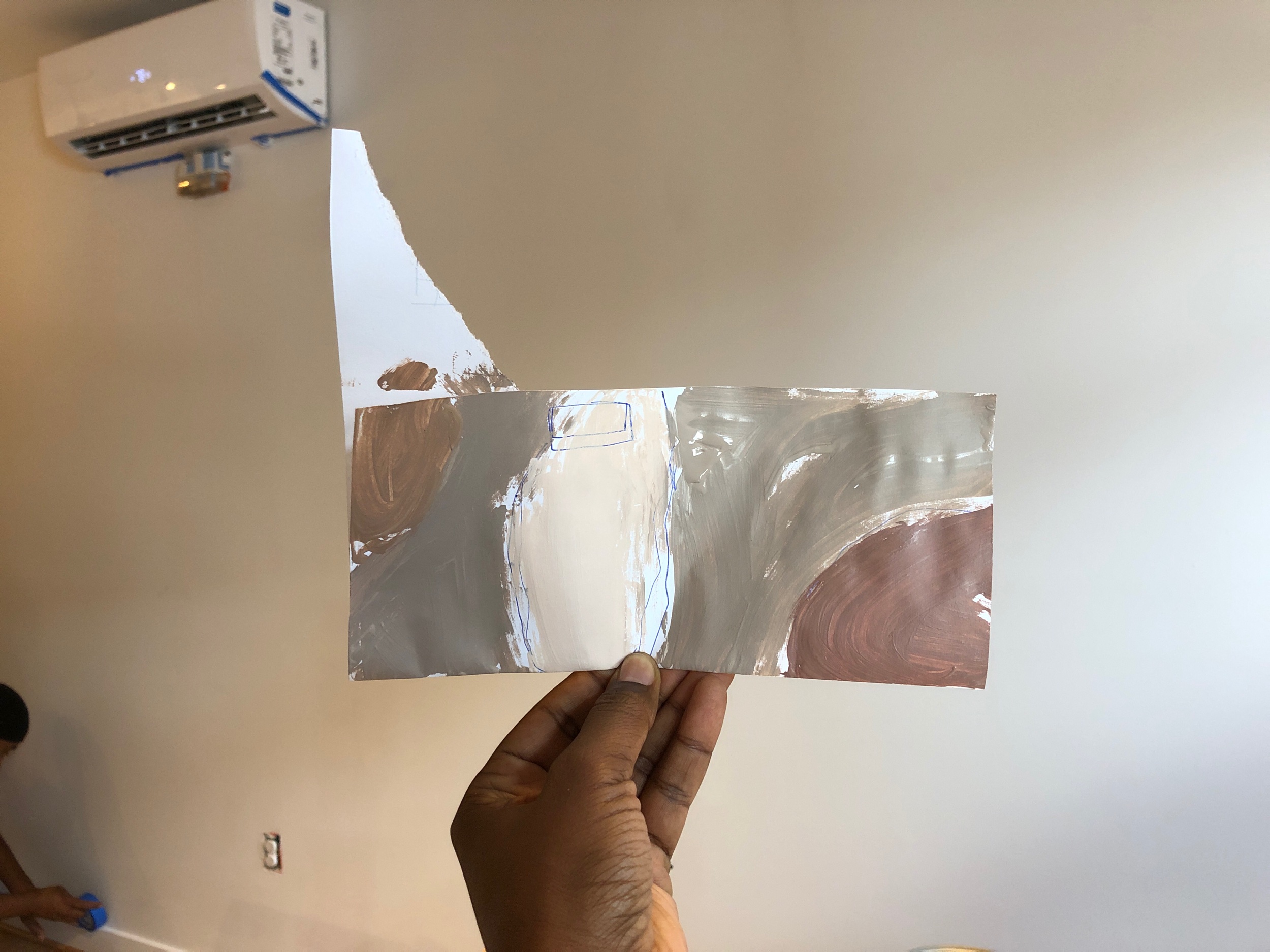
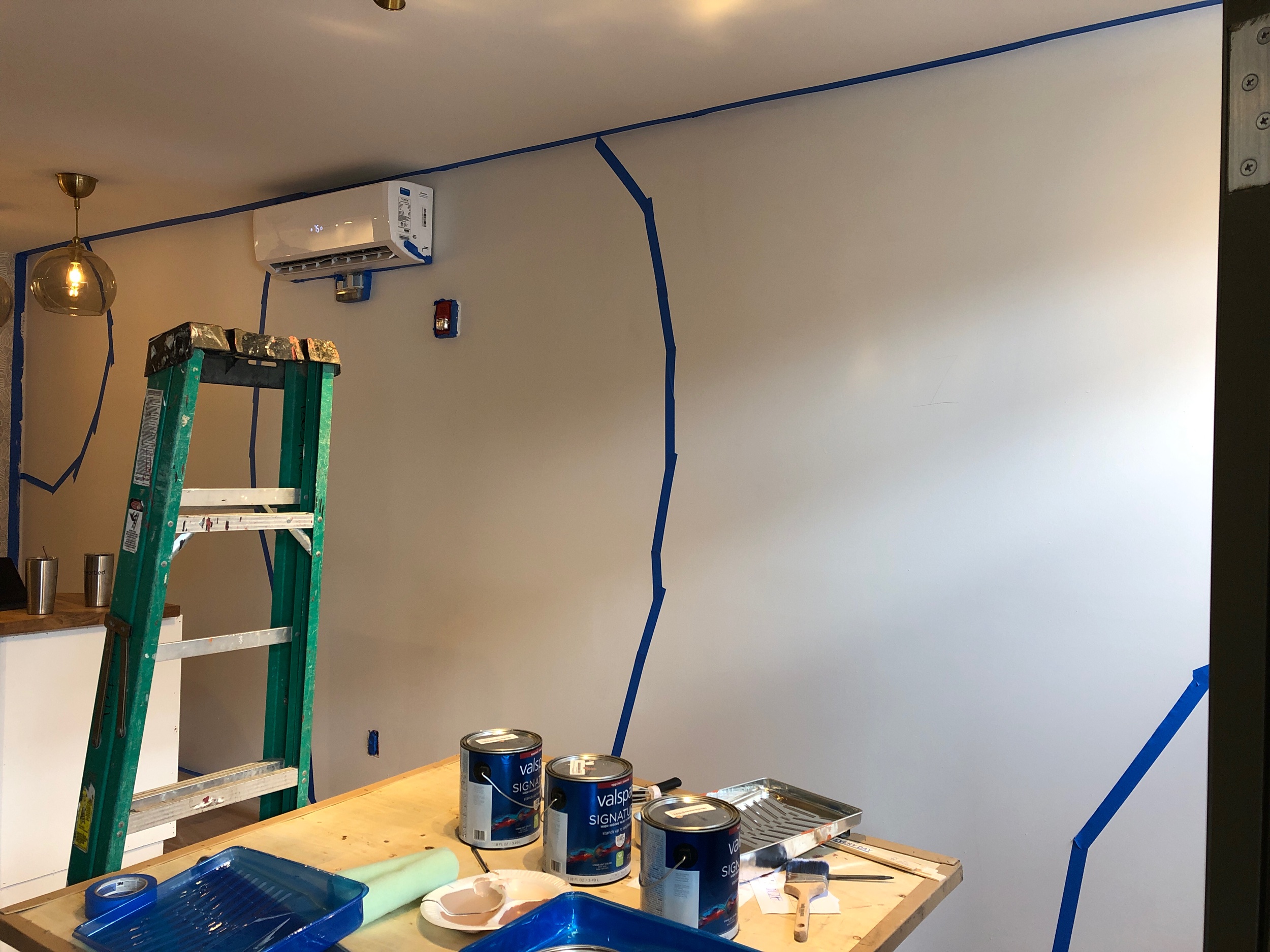
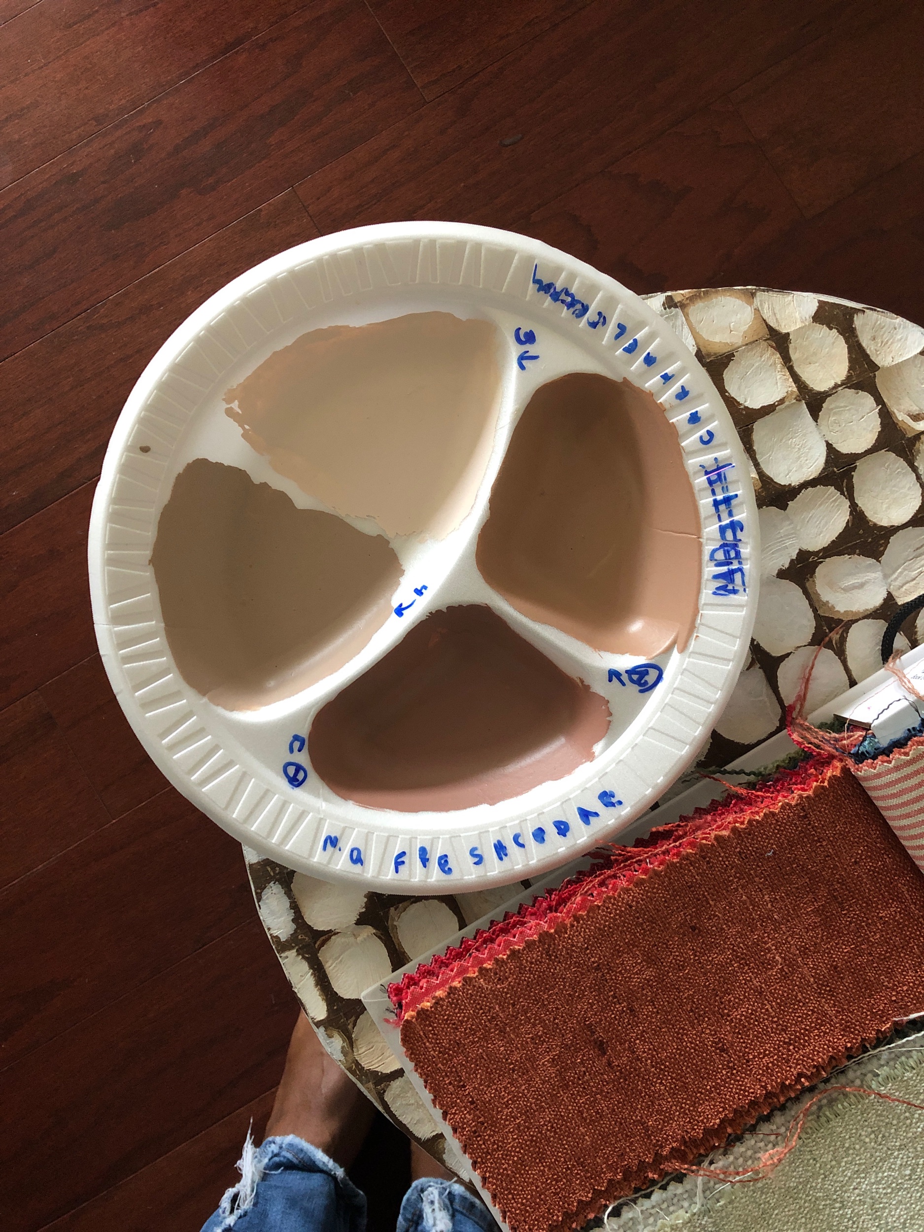
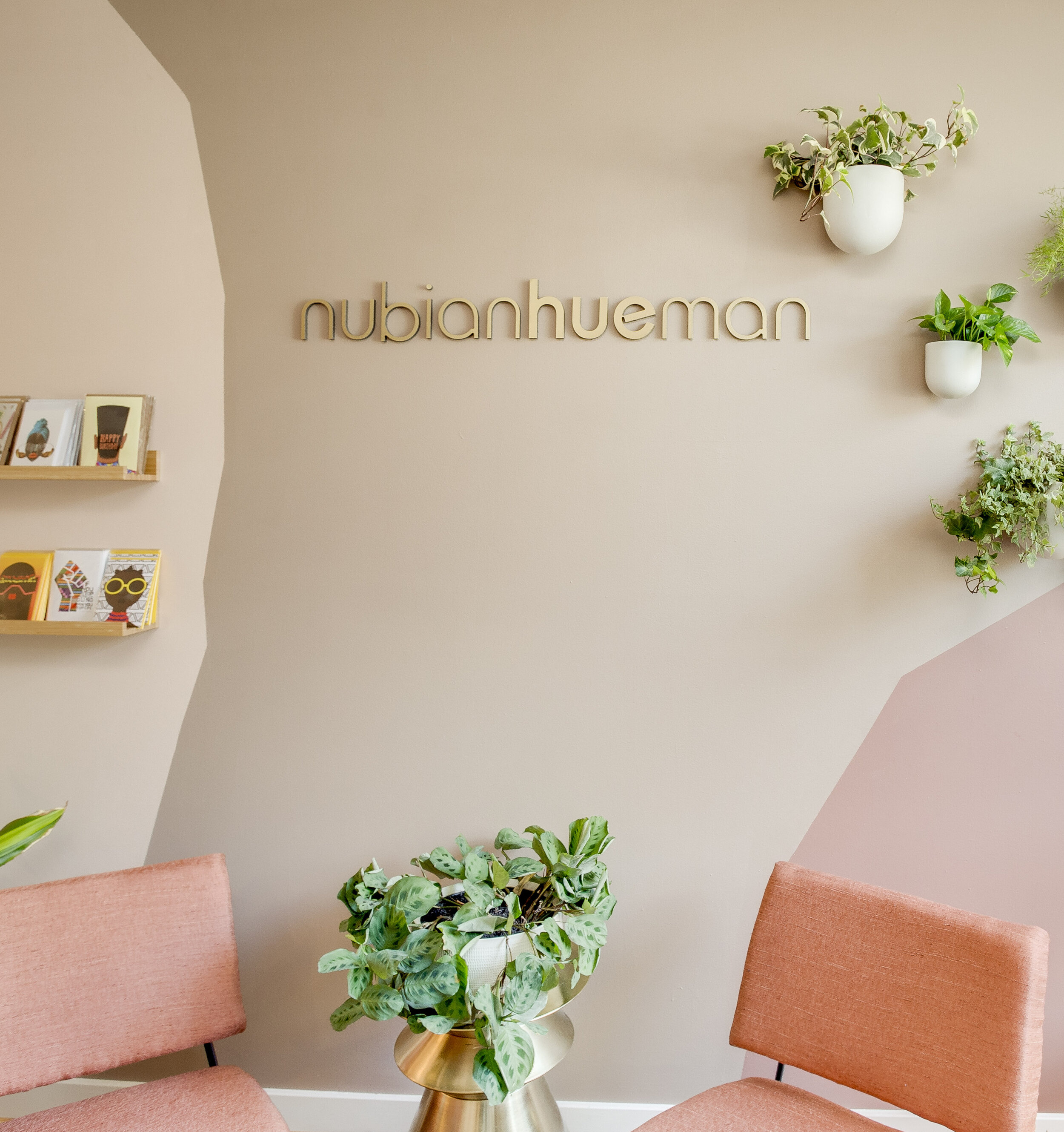
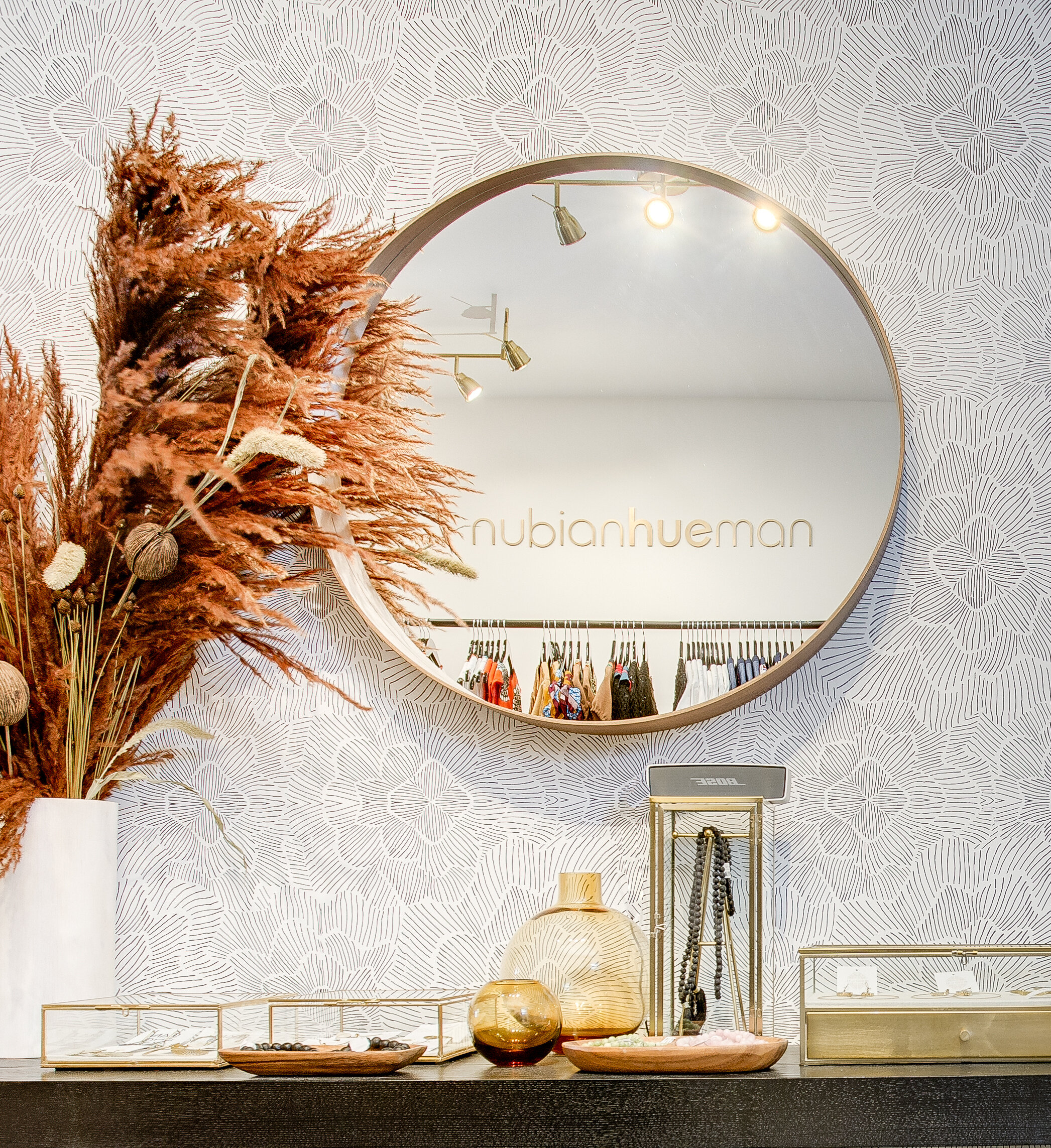
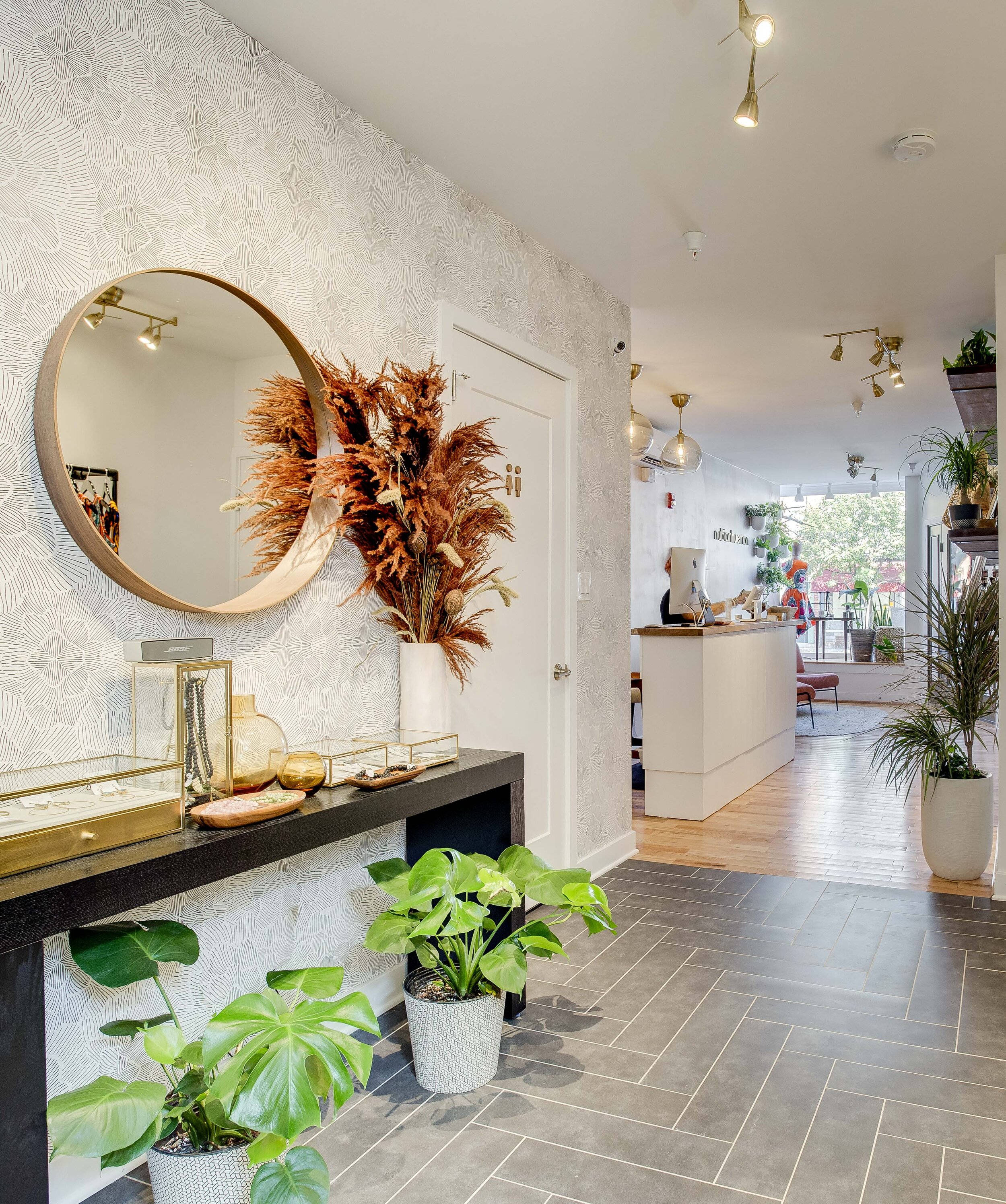
The feature wall is an homage to skin tones or HUES while staying within the color palette.
Here is the inspiration, the plan, The execution, and the finished product.
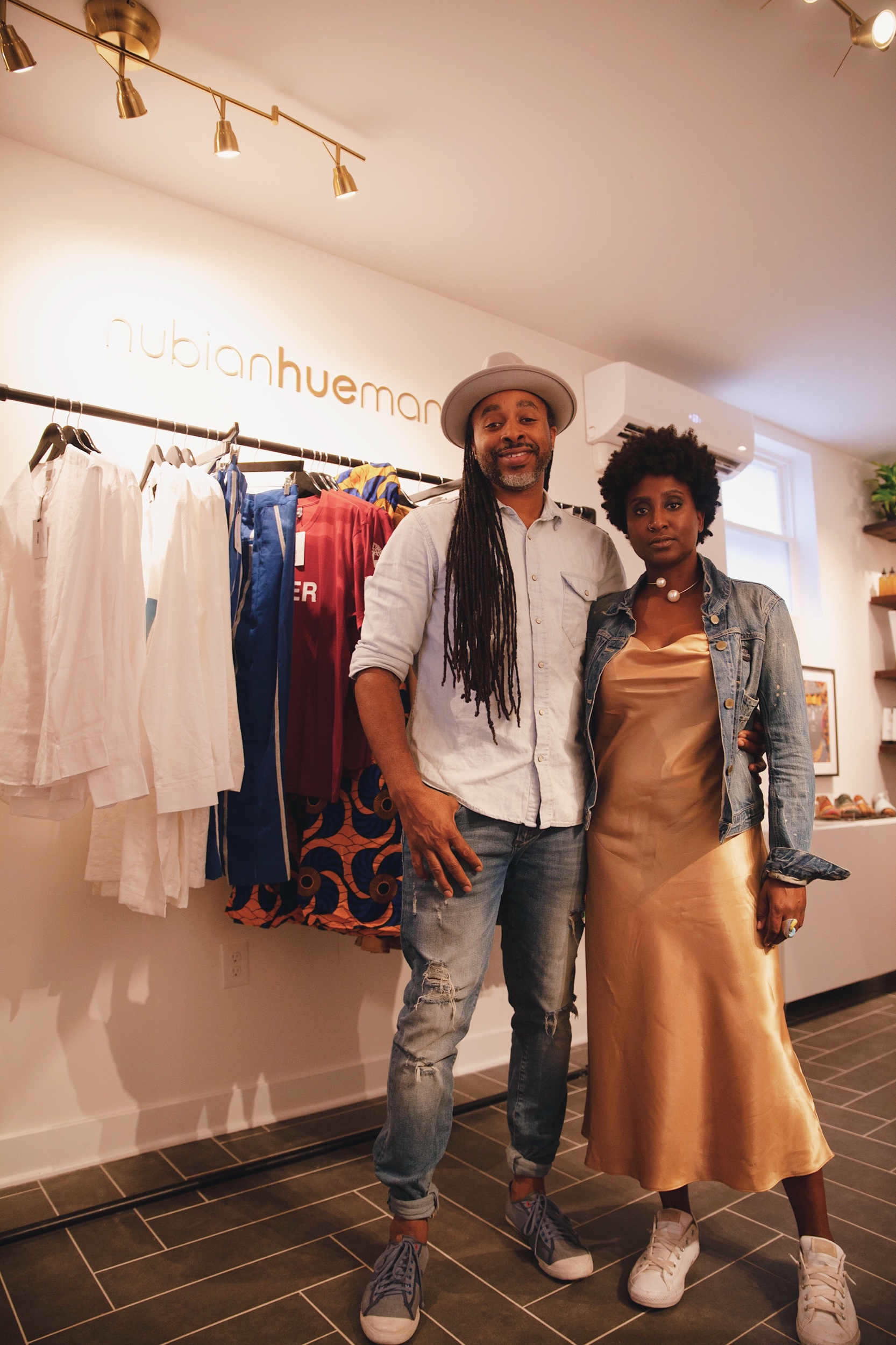
The signs were made by Lawrence of @heavypaperco.
The shelving was built custom. We bought planks from Lowe's and had them cut everything there and sanded and stained them ourselves. I had custom bracket made.
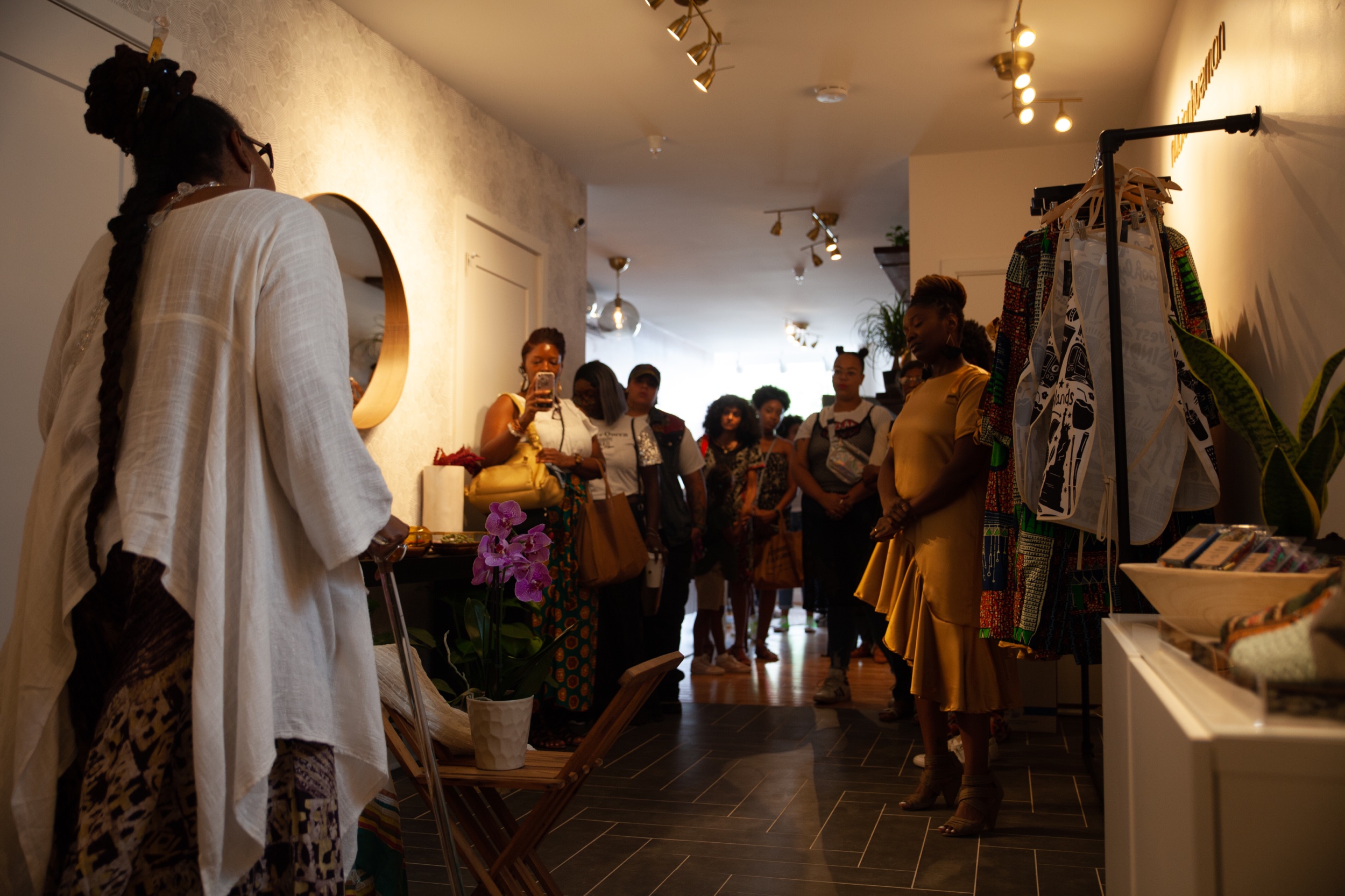
We are incredibly proud of this space and how everything came out! We had some setbacks like half the floor having to be ripped up! But at the end of the day, everything turned out lovely.
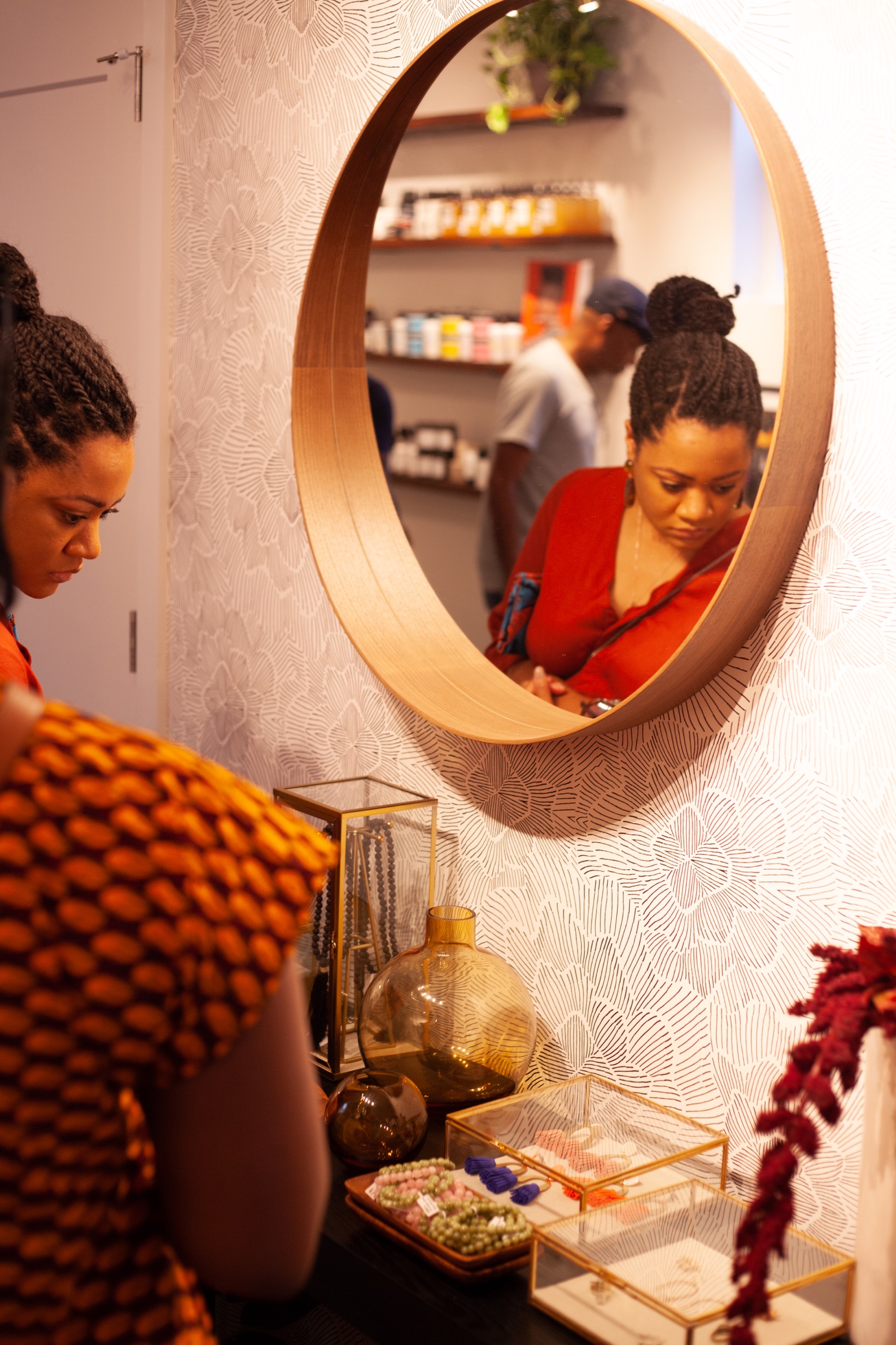
There are so many small small details in this space, leave me a comment if you want to know about something specific. Here are some of details on my favorites.
Console - All Modern
Clothing rack - Custom, parts from Lowes
Concrete table - Overstock
Nesting tables - All Modern


